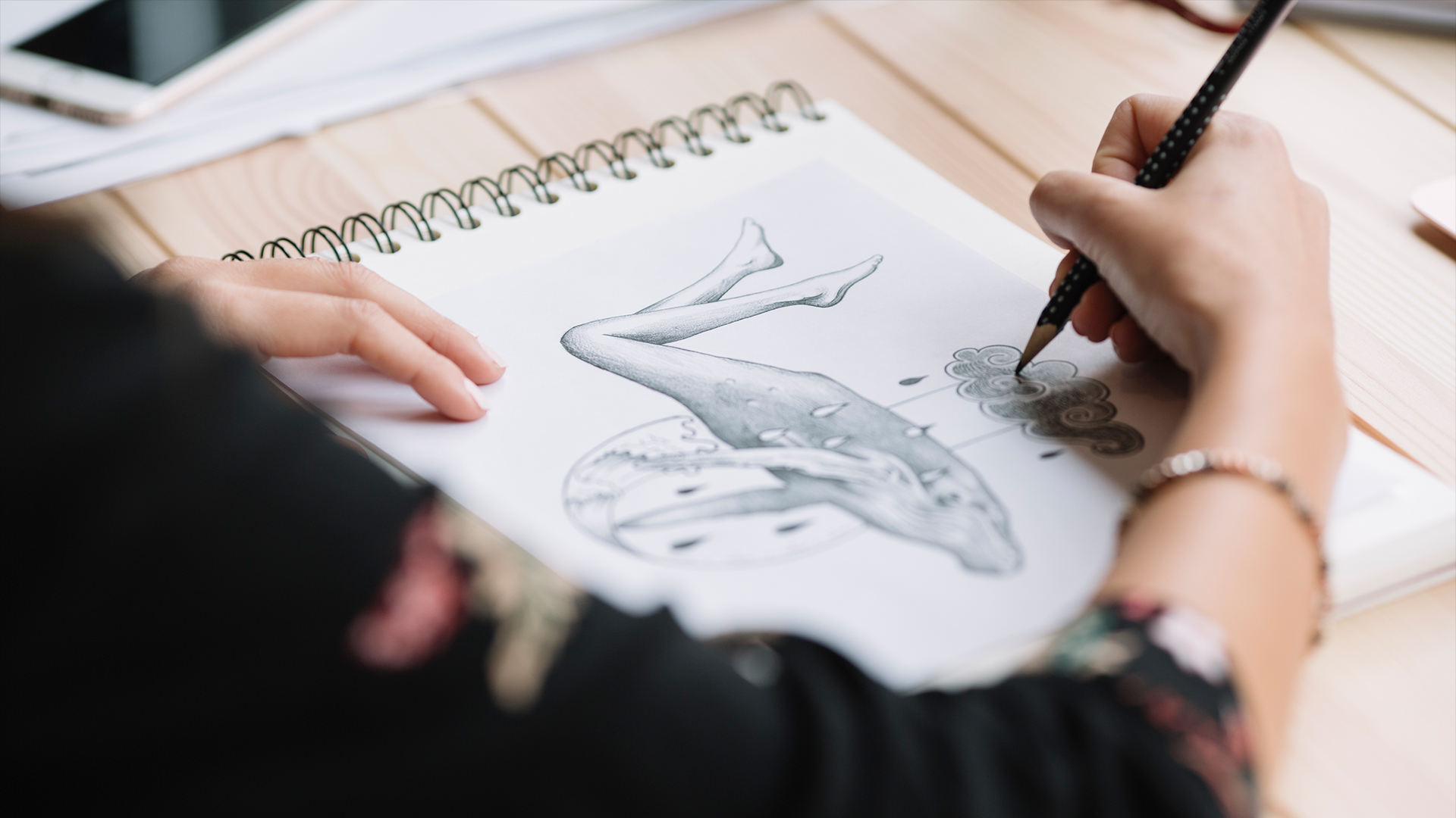
Understanding the Magic Behind Realistic Drawing
You know, after thirty-seven years of teaching drawing here in Montreal, I've watched countless students struggle with the same challenge - making their drawings look flat and lifeless. The secret ingredient they're missing? Proper shading techniques. It's like trying to cook a beautiful meal without seasoning - technically possible, but lacking that special something that makes people stop and stare.
Shading isn't just about making things darker in some places and lighter in others. It's about understanding how light dances across surfaces, creating the illusion of three-dimensional form on a two-dimensional page. When you master this art, your drawings transform from simple sketches into compelling visual stories that seem to breathe with life.
In Canada's art education landscape, we're seeing a renewed interest in traditional drawing skills. From Vancouver's art schools to Halifax's community centers, more people are discovering that digital tools can never fully replace the fundamental understanding of light and shadow. This comprehensive guide will walk you through everything you need to know about mastering shading - from basic principles to advanced techniques that professional artists use.
Whether you're picking up a pencil for the first time or you've been drawing for years, understanding these shading principles will elevate your artistic work to new heights. Let's explore how to add that crucial dimension of depth and realism to your creations.
The Foundation: Understanding Light and Form
Before we dive into techniques, you need to understand how light actually works. Every object you see is visible because light hits it and bounces back to your eyes. The way this light interacts with surfaces creates what we call the "form principle" - the foundation of all realistic shading.
Think about a simple sphere sitting on a table near a window. The side facing the light source appears brightest - this is your highlight. As the surface curves away from the light, it gradually becomes darker through what we call the midtones. The darkest area on the object itself is the form shadow, and the shadow it casts on the table is the cast shadow.
The Five Elements of Shading
- Highlight: The brightest point where light directly hits the surface
- Light tone: Areas receiving direct light but not as intense as the highlight
- Midtone: The object's local color without direct light or shadow
- Core shadow: The darkest area on the form where no direct light reaches
- Reflected light: Subtle light bouncing back into shadow areas from nearby surfaces
Understanding these five elements is like learning the alphabet before writing. Once you can identify them in real life, you'll start seeing them everywhere - from the coffee cup on your desk to the faces of people walking down Yonge Street in Toronto.
Essential Tools for Effective Shading
You don't need expensive equipment to create beautiful shading effects. Some of my most successful students have produced stunning work with just a few basic tools. However, having the right materials can make your learning process much smoother and more enjoyable.
For pencil shading, I recommend starting with a basic set of graphite pencils ranging from 2H to 6B. The H pencils create light, precise lines, while the B pencils produce rich, dark tones. Most art supply stores across Canada - from Michaels to local shops in smaller communities - carry quality pencil sets that won't break your budget.
Paper Selection Makes a Difference
The paper you choose dramatically affects your shading results. Smooth papers like bristol board allow for fine, detailed work and smooth gradations. Textured papers add character and can help create interesting effects, but they're more challenging for beginners. I usually recommend starting with medium-weight drawing paper with a slight tooth - it's forgiving and versatile.
Don't overlook blending tools either. Tortillons, blending stumps, and even tissue paper can help you achieve smooth transitions between light and dark areas. Some artists prefer using their fingers for blending, which gives a more organic feel to the work. Experiment with different tools to find what feels natural for your style.
A good eraser is just as important as your pencils. Kneaded erasers are fantastic for lifting highlights and creating subtle effects, while vinyl erasers work well for clean corrections. Many Canadian artists swear by the Staedtler Mars plastic erasers - they're reliable and readily available at most office supply stores.
Basic Shading Techniques Every Artist Should Master
Now let's get our hands dirty with actual techniques. The beauty of shading lies in its variety - there are countless ways to create tone and texture, each with its own character and application. Mastering these basic techniques will give you a solid foundation to build upon.
Hatching and Cross-Hatching
Hatching involves drawing parallel lines close together to create areas of shadow. The closer the lines, the darker the area appears. Cross-hatching takes this further by adding another layer of lines going in a different direction, creating even darker tones and interesting textures.
This technique has been used by masters for centuries - you can see beautiful examples in the works of Canadian artist David Milne, whose etchings demonstrate exceptional control of line and tone. The key is to keep your lines confident and purposeful. Hesitant, scratchy lines will make your drawing look uncertain and amateur.
Blending and Smooth Gradations
For subjects requiring smooth surfaces - like portraits or still life objects - blending techniques create seamless transitions from light to dark. Start by laying down your darkest tones, then gradually work toward the light areas, using circular motions with your blending tool to smooth the transitions.
Remember that less is often more with blending. Over-blending can make your drawing look flat and lifeless. Leave some texture and variation in your tones - this gives the work more character and prevents it from looking too polished or artificial.
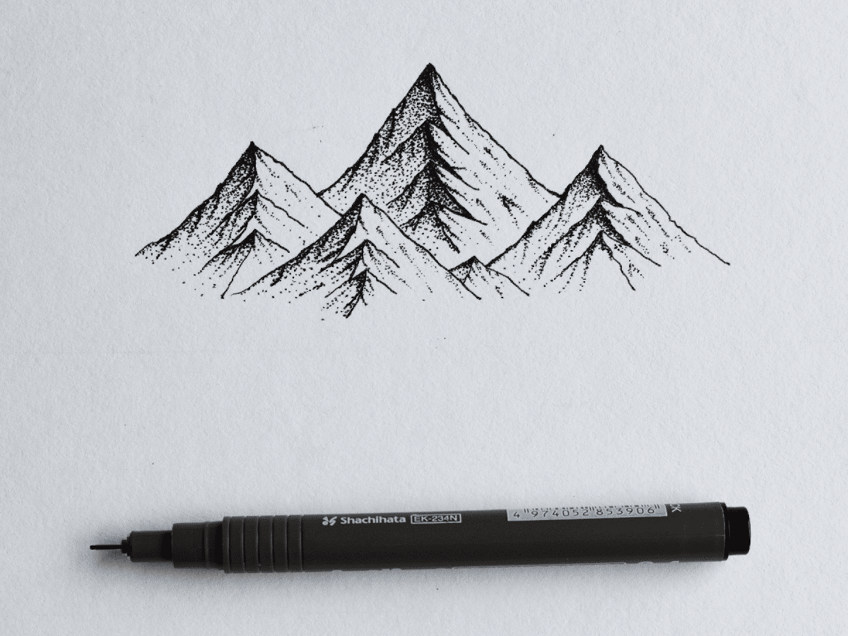
Stippling for Texture and Tone
Stippling uses dots instead of lines to create tone and texture. It's time-consuming but produces unique, organic-looking results. Vary the density and size of your dots to control the darkness and create interesting surface textures. This technique works particularly well for natural subjects like tree bark, stone, or weathered surfaces.
Advanced Techniques for Professional Results
Once you've mastered the basics, these advanced techniques will help you create more sophisticated and compelling artwork. These methods require patience and practice, but they're what separate amateur drawings from professional-quality work.
Working with Multiple Light Sources
Real-world lighting is rarely simple. Indoor scenes often have window light mixing with artificial lighting, creating complex shadow patterns. Learning to handle multiple light sources will make your drawings more realistic and dynamic. Start by identifying the strongest light source - this becomes your primary light. Secondary lights fill in shadows and create additional highlights.
Canadian winters provide excellent opportunities to study this phenomenon. The bright snow outside creates strong reflected light that bounces into interior spaces, while indoor lighting creates warm counter-shadows. This interplay of cool and warm light sources adds depth and atmosphere to your drawings.
Atmospheric Perspective Through Shading
Objects farther away appear lighter and less contrasted than those up close. This atmospheric perspective is crucial for creating depth in landscape drawings. As you move into the distance, reduce your darkest darks and lighten your overall tones. The contrast between foreground and background elements creates a sense of space and distance.
This technique works particularly well when drawing Canada's vast landscapes. Whether you're sketching the Rocky Mountains from Calgary or the rolling hills of Prince Edward Island, understanding how atmosphere affects contrast will make your landscapes more convincing and immersive.
Common Mistakes and How to Avoid Them
After decades of teaching, I've seen the same mistakes repeated countless times. The good news is that these errors are easily correctable once you know what to look for. Recognizing and avoiding these common pitfalls will accelerate your progress significantly.
The biggest mistake I see is students being afraid to go dark enough. They create wimpy, gray drawings that lack punch and drama. Don't be timid with your darkest darks - they provide the contrast that makes your lights appear truly bright. Push those shadow areas to create more dynamic, engaging drawings.
Inconsistent Light Direction
Another frequent error is inconsistent lighting throughout the drawing. Every shadow in your drawing should relate to the same light source. Before you start shading, decide where your light is coming from and stick to it. Draw a small arrow in the corner of your paper to remind yourself of the light direction.
Over-Blending Everything
While smooth blending has its place, over-blending every surface makes drawings look plastic and artificial. Different materials have different surface qualities - rough bark shouldn't be rendered the same way as smooth glass. Vary your techniques to match the textures you're depicting.
Finally, many students neglect reflected light in shadow areas. Shadows aren't just flat, dark spaces - they contain subtle variations and reflected light from surrounding surfaces. These small details add tremendous realism to your work.
Practical Exercises to Develop Your Skills
Theory is important, but skill comes through practice. These exercises, developed over years of teaching workshops across Canada, will help you internalize shading principles and develop muscle memory for different techniques.
Start with simple geometric forms - spheres, cubes, and cylinders. Set up a single light source and practice identifying and rendering the five elements of shading on each form. Spend at least a week on each shape until you can draw them confidently from memory.
The Daily Value Study
Commit to doing one small value study every day. Choose simple subjects - an apple, a coffee mug, a crumpled paper bag. Focus entirely on capturing the light and shadow patterns, ignoring details and textures. These quick studies, taking only 15-20 minutes each, will dramatically improve your ability to see and render form.
Copy the Masters
Find high-quality reproductions of drawings by master artists and copy them carefully. Pay attention to how they handle different textures and transitions. The Group of Seven, though primarily known for their paintings, created beautiful preparatory drawings that demonstrate excellent understanding of form and light.
Don't just copy mindlessly - analyze what you're doing. Ask yourself why the artist made certain choices and how they achieved specific effects. This analytical approach will help you internalize principles you can apply to your original work.
Building Your Artistic Journey Forward
Mastering shading is not a destination but a lifelong journey of observation and practice. Every drawing you complete teaches you something new about light, form, and the magic of creating three-dimensional illusions on flat surfaces. The techniques we've covered today provide a solid foundation, but your personal style will develop through consistent practice and experimentation.
Remember that progress in art comes in waves, not straight lines. Some days your drawings will feel effortless and inspired, while others might frustrate you. This is completely normal and part of the learning process. Keep your early drawings - you'll be amazed to look back and see how far you've progressed.
The Canadian art community is incredibly supportive and welcoming. Consider joining local drawing groups, attending workshops, or participating in online forums where you can share your work and receive constructive feedback. The encouragement and insights from fellow artists will accelerate your growth and keep you motivated during challenging periods. Your artistic voice is unique and valuable - these shading skills are simply tools to help you express it more effectively.
json