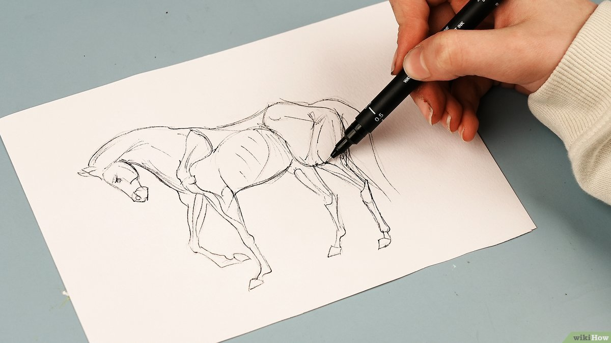
The Foundation of Realistic Portrait Drawing
When I first picked up a pencil to draw portraits forty years ago, I thought it was all about making things look "pretty." How wrong I was! Real portrait drawing, the kind that captures someone's soul on paper, is about understanding light, shadow, and the unique architecture of a human face.
Portrait drawing has become increasingly popular across Canada, with art schools in Toronto, Vancouver, and Montreal reporting a 40% increase in enrollment for figure drawing courses since 2020. This renewed interest stems from people wanting to disconnect from digital screens and reconnect with traditional artistic skills.
The secret to realistic portraits isn't just technical skill—though that matters plenty. It's about developing your eye to see what's really there, not what you think should be there. Too many students get caught up trying to draw the "perfect" nose or mouth, when what they should be doing is observing how light plays across their subject's actual features.
In this comprehensive guide, we'll explore the fundamental techniques that separate amateur portrait attempts from professional-quality work. Whether you're just starting out or looking to refine your existing skills, these methods will help you create portraits that truly capture the essence of your subjects.
Understanding Facial Structure and Proportions
Before you can draw what you see, you need to understand the basic structure underneath. The human skull provides the framework for everything else, and knowing its proportions will save you countless hours of frustration.
The classic rule states that an adult face is roughly five eye-widths across. The eyes sit halfway down the head (not higher up as most beginners assume), and the bottom of the nose falls about halfway between the eyes and chin. These aren't rigid rules—every face is unique—but they provide a solid starting point.
Key Proportional Guidelines
- Eye placement: Position eyes at the middle of the head from top to bottom
- Nose length: Typically spans from the eye line to halfway down to the chin
- Mouth position: About one-third of the distance from nose to chin
- Ear alignment: Top of ears align with eyebrows, bottom with nose base
- Forehead height: Usually equal to the distance from eyebrows to nose tip
Remember, these proportions change dramatically with age. Children have larger foreheads relative to their features, while elderly subjects often have more pronounced bone structure. Practice measuring these relationships with your pencil held at arm's length—it's an old technique that still works perfectly.
Working with Individual Variations
Once you understand standard proportions, you can better identify what makes each face unique. Some people have wider-set eyes, others have longer noses or fuller lips. These variations aren't "mistakes" to correct—they're the characteristics that make your portrait recognizable as that specific person.
I always tell my students in our Toronto studio to spend at least ten minutes just studying their subject before making any marks. Look for the relationships between features. Is the distance from nose to mouth shorter than average? Are the eyes closer together? These observations will guide your entire drawing process.
Mastering Light and Shadow Techniques
Light is everything in portrait drawing. Without proper understanding of how light falls across a face, even perfect proportions will look flat and lifeless. The good news is that light follows predictable patterns, and once you learn to see them, your portraits will immediately improve.
Start with simple, consistent lighting. A single light source coming from one side creates clear shadows and highlights that are easy to read and reproduce. Avoid fluorescent overhead lighting—it creates harsh shadows under the eyes and nose that make people look tired or ill.
The Five Elements of Light
Professional artists recognize five distinct areas of light and shadow on any three-dimensional form, including faces:
- Highlight: The brightest point where light hits directly
- Light tone: Areas receiving direct light but not the brightest point
- Shadow edge: The transition area between light and shadow
- Core shadow: The darkest part of the form shadow
- Reflected light: Light bouncing back into the shadow areas
Many beginners miss the reflected light, thinking shadows should be uniformly dark. But reflected light is what makes forms look three-dimensional rather than flat. Pay special attention to this subtle illumination along the shadow side of the nose, cheek, and jaw.
Creating Depth Through Value Relationships
Value—the relative lightness or darkness of tones—creates the illusion of depth on your flat paper. Squinting at your subject helps you see the major value patterns without getting distracted by details.
Professional tip: Establish your darkest dark and lightest light early in the drawing process. Everything else falls somewhere between these two extremes. This approach, taught in art schools across Canada from OCAD University to Emily Carr University, helps maintain consistent value relationships throughout your portrait.
Developing Observational Skills
The difference between good and great portrait artists isn't talent—it's the ability to really see. Most people look at a face and see "eyes," "nose," and "mouth." Artists learn to see shapes, angles, and value relationships.
One exercise I've used for decades involves drawing upside-down photographs. When the image is inverted, your brain can't easily identify facial features, forcing you to draw what you actually see rather than what you think should be there. Try this with a simple portrait photograph—you'll be amazed at how much more accurate your proportions become.
Training Your Eye for Accuracy
Measuring is crucial for accuracy, but it shouldn't become a crutch. Use your pencil to compare relationships: How does the width of the eye compare to the space between the eyes? How many "eye lengths" fit between the outer corners of the eyes and the edges of the face?
Practice negative space drawing—focus on the shapes around and between features rather than the features themselves. The triangle of shadow beside the nose, the shape of the space between the lips, the area between the eyelid and eyebrow. These negative shapes are often easier to see accurately than the positive forms.
Working from Life vs. Photographs
While photographs are convenient, nothing replaces drawing from a live model. Photographs flatten the subtle value relationships that exist in real life and can distort proportions depending on the lens used. If you must work from photos, use high-quality images with good lighting contrast.
Many Canadian cities offer figure drawing sessions with live models. Toronto Life Drawing, Vancouver Urban Sketchers, and Montreal's Centre des arts visuels all provide regular opportunities to practice with live subjects. The investment in model fees pays dividends in improved observational skills.
Essential Drawing Tools and Materials
You don't need expensive materials to create excellent portraits, but having the right tools makes the process more enjoyable and gives you better control over your results.
For pencil work, I recommend a range from 2H to 6B. The harder pencils (H grades) work well for light initial construction lines, while the softer grades (B) allow for rich, dark shadows. A good kneaded eraser is essential—it lifts graphite without damaging paper texture and can be shaped to create highlights or clean up small areas.
Paper Selection and Preparation
Paper choice significantly affects your final result. Smooth papers like Bristol board work well for detailed, precise portraits with minimal texture. Medium-tooth papers like Strathmore 400 series provide enough grip for graphite while allowing smooth blending. Avoid heavily textured papers for realistic portraits—the tooth interferes with fine detail work.
Size matters too. Working too small forces you to rush past important details, while extremely large drawings can become overwhelming. I recommend starting with 9"×12" or 11"×14" paper—large enough to include meaningful detail but manageable for beginners.
Blending Tools and Techniques
Blending stumps, tissues, and your fingers all create different effects. Stumps give precise control for small areas, tissues work well for large, soft shadows, and fingers provide the smoothest blends but can leave oils on the paper.
However, don't over-rely on blending. The most realistic portraits often combine smooth blended areas with sharp, unblended lines. The key is knowing when to blend and when to leave your marks alone.
Common Mistakes and How to Avoid Them
After teaching portrait drawing for over twenty years, I've seen the same mistakes repeatedly. The good news is that recognizing these common errors helps you avoid them in your own work.
The biggest mistake is starting with details before establishing overall proportions and major value patterns. Students get excited about drawing the eyes or mouth and spend an hour perfecting them, only to discover later that they're in the wrong position or wrong size relative to other features.
Proportion and Placement Errors
Most beginners place facial features too high on the head, especially the eyes. Remember that eyes sit at the middle of the head from top to bottom, not in the upper third as many people assume. This error makes portraits look childlike or cartoon-ish.
Another common issue is making all features the same size. In reality, one eye is often slightly larger than the other, lips aren't perfectly symmetrical, and nostrils are rarely identical. These subtle asymmetries make faces look human rather than like mannequins.
Value and Contrast Problems
Many beginners are afraid to go dark enough in their shadows. They create gray, flat-looking portraits because they don't push the contrast between light and dark areas. Remember that you can always lighten an area with your eraser, but you can't darken beyond the limits of your pencil.
Conversely, some students make everything too dark, losing the subtle middle tones that create realistic skin texture. Squint frequently at both your subject and your drawing to compare overall value relationships.
Overworking and Lack of Confidence
Confidence shows in your line quality. Hesitant, scribbly lines make portraits look uncertain and amateurish. Practice making confident, deliberate marks even when you're not sure they're perfect. You can always adjust, but confident lines immediately improve the professional appearance of your work.
Know when to stop. Overworked drawings lose their freshness and vitality. Some areas should remain suggested rather than fully rendered—this actually helps viewers' eyes focus on the most important parts of the portrait.
Building Your Portrait Drawing Skills
Consistent practice with focused objectives will improve your portraits faster than random sketching. Set specific goals for each drawing session: "Today I'll focus on accurate eye placement" or "This session is about getting smooth value transitions in the cheek area."
Start with simple subjects—elderly people with character lines and strong bone structure are often easier to draw realistically than smooth-skinned young faces. Children's portraits require advanced skills because their features are more subtle and their proportions different from adults.
Progressive Skill Development
Begin with profile views, which eliminate the complexity of drawing two eyes symmetrically and show clear silhouettes. Three-quarter views come next—they provide dimension while still being manageable. Full frontal portraits are actually the most challenging because any asymmetry becomes immediately obvious.
Practice drawing the same subject under different lighting conditions. This exercise teaches you how light affects the appearance of features and helps you understand facial structure more completely. A strong side light, soft window light, and dramatic overhead lighting all reveal different aspects of the same face.
Studying Master Artists
Look at portrait drawings by masters like John Singer Sargent, Leonardo da Vinci, and contemporary artists like David Hockney. Notice how they handle edges—some are sharp and defined, others soft and lost. Study their value patterns and see how they suggest detail without drawing every single line or texture.
Canadian artists like Alex Colville and Mary Pratt, while primarily painters, demonstrate excellent understanding of light and form that applies directly to drawing. Their work shows how simplification and careful observation create more powerful images than excessive detail.
Taking Your Portraits to the Next Level
Once you've mastered basic proportions and value relationships, you can explore more advanced concepts like edge quality, atmospheric perspective, and psychological presence in your portraits.
Edge quality—the sharpness or softness of lines and value transitions—creates hierarchy in your drawing. Sharp edges draw attention, soft edges recede. Use this principle to guide viewers' eyes to the most important parts of your portrait, typically the eyes and expression lines around the mouth.
Consider the mood and personality of your subject. A soft, gentle person might call for overall softer treatment, while someone with a strong personality might benefit from more dramatic contrasts and sharper edges. These artistic choices go beyond mere copying to create portraits that capture inner character as well as physical likeness.
Developing Your Personal Style
While learning, focus on accuracy and realism. But as your skills develop, you'll naturally begin making choices about what to emphasize and what to subordinate. This is the beginning of personal style—not a conscious decision to be different, but a natural result of your unique way of seeing and interpreting.
Some artists excel at capturing fleeting expressions, others at rendering beautiful light effects. Some prefer precise, detailed work while others work more loosely and impressionistically. Pay attention to what aspects of portrait drawing excite you most, and gradually emphasize those strengths.
The journey to mastering realistic portrait drawing takes years, but the rewards begin immediately. Each drawing teaches you something new about seeing, about light, about human character. Whether you're sketching family members, working toward professional commissions, or simply enjoying the meditative process of careful observation, these fundamental techniques will serve as your foundation for continued growth and artistic satisfaction.
json